25 October 2013

How I Style: Winter in California

My Style: "Winter in California"

My Style: "Winter in California" by the-saltine-herself

Hi all! So, I haven't posted in about two months (shame on me), so I'm going to use this set as sort of a come-back.  I really love this look for two reasons: First, this outfit something I'd typically wear during the winter.  Secondly, it includes a sweater.  As you know, I have a very steamy, ongoing romance with baggy sweaters, much to the dismay of my mother, who appreciates form-fitting clothing much more (when it comes to style, we don't agree on much, to be honest).  Anyway, I digress.

AS FAR AS THE OUTFIT GOES...
It is very casual, but still stylish.  As I've mentioned before, dark wash jeans hide any over-curviness on the bottom half and slim down thighs (especially saddle-bags, which we, ladies, can't really do anything about), so they are perfect not only in color (darker for the winter), but also in their ability to flatter a woman's shape.  The shoes are classic - honestly, you can't go wrong with oxfords, in my opinion.  Lastly, the sweater, which has a three-quarter sleeve length (feminine and casual at the same time) and just the right amount of bagginess, tops the cake.  Actually, I amend that statement: it's not "baggy," at all, just not form-fitting, so it lays over the chest area in a very relaxed way, giving an effortless quality to the outfit as a whole.  PLUS, it's white (you'll look like a goddess, dah-ling), and it's warm (looks warm, too).  In short, this is an awesome sweater.

ACCESSORY TALK:
1. Bath & Body Works "Twilight Woods" Body Mist: 
WHO DOESN'T LOVE THE SMELL OF THIS?  It's amazing - cozy and sexy and mysterious.  That's my kind of scent ;)

2. NYX Jumbo Eye Pencils in "Iced Mocha" and "Yogurt":
I actually own both of these, and I must say that I'm very pleased.  NYX is pretty cheap in comparison to other brands, but their quality is still amazing.  These apply smoothly (even on wrinkly eyelids!) and are so quick to use (perfect for an I-woke-up-late kind of day).  Also, they look GREAT on pretty much any skin tone (I know because I do everyone's makeup, haha).

3. Essie Nail Polish in "Smokin' Hot" and "Good as Gold":
Again, I own these polishes (you've seen "Good as Gold" in other posts), and I absolutely LOVE them.  I only recently purchased "Smokin' Hot" (along with "Angora Cardi") and it's already one of my top-five favorite polishes.  

ANYWAY, I'm pretty sure that's everything...
As a side note, I typed this entire post with a splint on my right index finger (athlete problems), and I'm pretty proud of myself.
Thanks for reading!

Love you all

<3

14 September 2013

OOTW: First Week of Senior Year

Hey all!  So, tragedy has unfolded: my iMac has been having some serious mood swings lately, THEREFORE, the making of YouTube videos must be put on hold for now (which sucks, because I already pre-filmed about three of them).  ON A HAPPY NOTE, I have a post for you today: MY FIRST WEEK OF SCHOOL IN OUTFITS.  I'm now a senior in high school (I know, right?), so I decided to start out right by documenting the beginning of the end.  BEFORE I BEGIN, THOUGH, I first need to explain my philosophy when it comes to dressing for the first week of school.  Many people who are not me try to wear as many new, trendy outfits as possible during the first few days of school - dress to impress, right?  WRONG.  Well, it's not wrong, it's just NOT MY STYLE (I'm different, yeah, I'm different).  My method is to try to keep my outfits stylish yet simplistic during the first week.  The reason for this is that I'm pretty observant, and over the years I've noticed that over half of the girls who show up looking fabulous during the first week start to decline and then plummet into a sad, dark pit of mediocrity during the second week.  TO AVOID THIS, I have developed my philosophy: 
  1. Dress well the first week (well enough to keep up with the first-week-frenzy)
  2. Dress even better - about 85% of your fashion capacity - the second week (people will start to notice that you have killer taste, now)
  3. Dress incredibly the third week (all the girls be like: oh my gosh, I, like, totally want her whole closet)
USING THIS METHOD, you will soon be known as one of the best dressed.  People will look to you for inspiration, which is a very cool thing.  Please know that I'm not encouraging materialism or telling you to become consumed with societal acceptance when it comes to your wardrobe.  I just want you all to look good.  Really good.  AS A MOTIVATIONAL SIDE NOTE: knowing you look amazing makes you feel awesome, giving you a major confidence boost, which, one of these days, might be exactly what you need :)

First Day of School (Tuesday):
Foreign Exchange Top ::: PacSun Jeans ::: PacSun Bandeau ::: Target Sandals ::: Claire's Earrings (Hoops and Studs)
BLURB TIME: Notice the balance.  I paired an open-back tank top with mid-rise (nearly high-rise) jeans.  The show of skin on the back is balanced with the higher waist on the jeans, so you're not looking too scandalous on the first day.  AS A SIDE NOTE: Dark wash jeans slim curvier thighs and a curvy butt (yes, that's why I'm wearing them).  Also, the tank-and-jeans deal is perfect for both the warm weather and the air-conditioned classrooms.  

 Second Day of School (Wednesday):
Brandy Melville Sweater ::: Foreign Exchange High-Rise Shorts ::: Target Sandals ::: Heavenly Couture Black Bandeau ::: Claire's Earrings (Hoops and Studs) ::: Claire's Cross Necklace
BL-BL-BL-BLURB: Here we go again with the balance.  Shorts with a light sweater (seriously, its Brandy, so it's nearly equivalent to just wearing the bandeau), in my opinion, are a little bit classier and more appropriate than short shorts and a strappy tank top during the first week of school.  You want to make a chic first impression, yes?  Good.  Another note on the outfit: sweaters and shorts paired together are marvelously effortless, which is very attractive, indeed ;)

QUICK NOTE: 
I woke up late on day three, and didn't have time to take pics during my open periods (my school does block scheduling) either, so I don't have that outfit posted here.  SORRY EVERYONE.

Fourth Day of School (Friday):
Windsor Top ::: PacSun Jeans ::: Windsor Bandeau ::: American Eagle Outfitters Belt ::: Soda White Slip-on Shoes ::: Claire's Earrings (Hoops and Studs)
BLURBIN' IT UP: I know what you're thinking: shut up about the balance.  To that, I say: never.  Okay, so it's not about showing skin or anything this time.  ON THIS EPISODE OF THE LIFE AND TIMES OF ME, it's about femininity and simplicity.  The shirt is very light and intricate and girly (which I completely am in love with), so I paired it with white slip-on shoes, which are very casual and cool.  That way there's not an overload of daintiness, allowing the top to stand out :)

That's all, lovelies!  Thanks for reading - I hope you enjoyed :)
BEFORE I SAY GOODBYE, THOUGH, I would just like to say that I made all of these three-part photo collages on a website called Photovisi.  It's GENIUS, I encourage you all to check it out!

Love you all

<3

23 August 2013

Ulta Beauty HAUL and REVIEWS

Hey gals! I haven't posted in AGES because I've been updating the overall look of my blog (you like?) and stressing over NOT ONLY the currently half-broken state of my iMac (I use iMovie for my YouTube videos - you see the problem, yes?) BUT ALSO the currently not-even-close-to-done state of my AP summer assignments.  Anyway, my life has been crazy, but I'm back now :) So here's a few things I picked up about two days ago from the fairy wonderland that is ULTA...

 Real Techniques Stippling Brush
The Real Techniques brushes are my absolute favorite.  Starting with the most shallow reason why, they look awesome - sleek and high-end while still looking young and fun (orange, purple, and pink? Hell yeah).  Secondly, they get the job done right, and there are many jobs to be done with a single brush - you can honestly use them for whatever you want, and the result is still fantastic.  I haven't used it yet (the packaging is just too beautiful, I didn't want to open it haha), but I plan to use it for my face (following the Real Techniques Foundation Brush) just to get that perfect, smooth finish.
  
 Burt's Bees Natural Face Solutions: Intense Hydration Night Cream
So I've always loved Burt's Bees, but because of their slightly-more-pricey products, I've never actually tried anything other than their hand salve (amazing) and their lip balm (ten out of ten).  I bought this out of panic and necessity: I've changed my acne routine (I'll do another post about that later!) and it's begun to dry out my face around my nose and mouth.  Believe me when I say that white crust around the outside of your lips IS NOT CUTE.  I saw "Intense Hydration" and instantly picked it up for this reason.  Also, it has clary sage, which, if you don't know, is an herbal plant (I think it's part of the mint family, which explains the fantastic smell of this product) known for its high anti-oxidant content and ability to clear infection.  FUN FACT: If you get it in an essential oil, it can even help to balance female hormones :)

REVIEW: Simply put, this stuff is incredible.  When I first opened it, there was a bit of product on the underside of the cap (you know how that happens), which I just dabbed with my finger to use for the first time (I tend to be very cautious because my skin is so sensitive).  The next day, I woke up and the skin around my mouth and nose was 95% repaired - no white crust, no look of dryness, only a SLIGHT roughness in the previously-affected areas.  Last night I used it again, and I woke up this morning with ABSOLUTELY FLAWLESS skin, and I haven't even used the product from the tub yet (I'm still using dabs from the underside of the cap)!  Extra Plus: it made my lips super smooth and plump-looking.  Anyway, I highly recommend - after all, it isn't technically expensive, just a bit pricier than your run-of-the-mill drugstore lotion or cream.  Then again, this is NOT just a run-of-the-mill product, so it's totally worth it.

Andrea EyeQ's Makeup Remover Pads
I hate taking off my makeup - no, I don't think you understand how much I hate it.  It's late (I'm talking LATE) at night, and I'm about to fall over from my explosively exciting day, and I have to turn to the mirror and basically scrub my eyelashes off with make-up remover wipes that claim to remove waterproof mascara and liner.  I bought this as a test, just to see if the results (and the laborious process) would be any different.  A few things that specifically drew me to this product were the words "Oil-Free," that they're "Extra-Gentle," (who wants wrinkles, right?) and the fact that they claim to be "Perfect for contact lens wearers."  Makeup remover that if safe for contact lens wearers seems to be pretty standard, but it's actually tougher to find than you would think, so this product was a great find for that reason.

REVIEW: I used to pull away my makeup remover wipe and see at least three eyelashes (so sad) and a bunch of black residue, but when I looked in the mirror, the job was not even close to being done.  I CAN SAY NOW THAT I WILL NO LONGER HAVE TO ENDURE LATE-NIGHT DISAPPOINTMENT OR THE UNTIMELY DEATH OF MY EYELASHES.  I used this last night (I had a ton of makeup on yesterday because I had places to be) and the eye-makeup, for lack of a better word, melted off.  It only took about three swipes (on each eye) before my eyes were almost completely clear of makeup, and I hadn't even thought about grabbing a standard makeup remover wipe yet.  HIGHLY RECOMMEND. 

09 August 2013

How I Style: Maxi Skirts!

Master the Trend: Maxi Skirts!

Master the Trend: Maxi Skirts! by the-saltine-herself

Hey ladies! Here's just a quick guide to how I would style maxi skirts, since they are a very particular trend.  Sometimes, when you have a piece thats so flowy (something that floats AWAY from your body, in other words), it's hard to style and not look "frumpy" or "baggy."  I happen to like when things float away from my body, so maxi's are some of my favorites :)

How I Style (Left to Right):

1. Lace Crop Top + Dotted Skirt: In this outfit, I mixed print and texture.  A combination like this always makes for a visually interesting outfit, and will almost always turn out beautiful (unless you make some crucial mistakes).  In order to avoid a fashion mishap, try to match the colors, keep them complimentary, or keep them in the same color palette (different shades of blue, etc.).  For accessories (the pink necklace), I used a color that wasn't otherwise seen in this simple outfit.  I kept the shoes and accessories complimentary so that they would pop but not seem out of place (pastels always complement eachother).  Overall, this outfit shows how you can connect colors and how you can mix prints and textures.

2. Print Skirt + Solid Top: This outfit is pretty easy to put together, because it's showing a print with a solid.  The thing about this outfit that makes it special is obviously the skirt, making that the focus.  At the same time, though, the top is not without detail - there is a scalloped hem on the tank, allowing it to hold its own and not fade completely into the background.  The skirt is so visually busy that the solid top tones down the outfit, which is good because it creates a BALANCE.  This outfit exhibits the "matching colors" idea as well as the "print and solid" trend, because black is in the skirt.  Black IS A NEUTRAL, though, just like white and beige, so it would work with this skirt even if it didn't have black.  Simple sandals top off the entire ensemble.

3. Floral Bustier + Solid Skirt: This outfit exhibits one of this year's newest trends, which is the bustier.  Bustiers are cut very close to the body (they are also referred to as corsets), and so the combination with the skirt that floats away from the body, again, creates a very appealing BALANCE.  Balance is always the goal in creating a perfect outfit.  Also, the top is cropped, so you're going short on top and long on the bottom.  The shoes are a neutral, allowing the colors in the top and skirt take the main stage, but (just like the black shirt in the last outfit) are not completely boring, as they have the sparkles on the toe to keep them looking interesting.  The colors match between the top and the skirt, both having a pale pink shade.  I added the short cross necklace simply to fill the space between the face / neck and the chest, although this isn't necessary to perfect the outfit.

4. Starbucks Tank + Chevron Skirt: In this outfit, I used a printed skirt and a shirt that can be considered printed OR solid.  Many times, shirts that have a big print (you've seen shirts with large cat-faces, right? Haha) like the Starbucks logo here, are considered solid because that print embodies the whole shirt.  Anyway, because of the "solid" shirt, the printed skirt doesn't seem overpowering or overdone - it looks very casual.  The colors are pretty much the same top to bottom, creating a very put-together vibe as well as allowing the green in the tank to stand out.  When you have black and white, usually, it's already a statement in itself, so accessories don't need to be the super-standout pieces, which is why I've chosen simple sunglasses and black sandals to complement this outfit.

ALRIGHT that seems to be everything! I hope you took a few style tips from this so that you can wear your maxi skirt with killer confidence :) They are such beautiful pieces - honestly, everyone should own at least one .... or four ...

Thanks so much for checking out this post!  Make sure you follow my blog and comment below which outfits were your favs! I personally like one and four the best ;)
Stay tuned for my YouTube videos, blow some extra time on my Polyvore, and feel free to stalk my Pinterest EVERY SINGLE DAY, haha ;)

Love you all

<3

07 August 2013

Manicure: August Grapevine

Hello all! I haven't posted my manicure in a while because I've been terribly lazy (as in, I've been giving myself quick french manis for the last 2 weeks or so) and haven't had anything on my nails worth posting.  The wait is over, though! I pained my nails a dark purple with some mint on the tips, hence the "grapevine" reference, haha.  Anyways, I hope you enjoy! 


Unfortunately, my pictures didn't do the colors justice (sometimes the lighting in my house goes super funky).  The dark purple was Revlon's "Bold Sangria," and the mint was Sally Hansen's "Mint Sorbet."  Both are absolutely beautiful alone but I decided I would combine them just to switch things up a bit.  Also, the mint brightens up the purple so the manicure doesn't look too winter-y.  Anyway, that's everything :)

Thanks so much for checking out this post! I'll have 2 Haul videos posted shortly, so keep your eyes open on my YouTube channel :) 

Love you all

<3

31 July 2013

How-To: Decoupaged Jewelry Box

Hello lovelies! If you regularly read this blog (or if you just read the title of it....either one) then you know I always always always post about FASHION and BEAUTY and anything and everything related to that sphere.  I never post about LIFESTYLE, so this is going to be the first.  I decided I needed a jewelry box - one that nobody else in the entire world could possibly have.  And that, my wonderful readers, is the beauty of "homemade."  Anyway, I bought a couple of boxes from Michael's Craft Store - just wooden boxes with glass windows - a while ago (they were to be my entertainment after AP testing, since I would have barely any homework once those classes were over with), but never got around to actually embellishing them.  So, now that I've done ONE of the two boxes I bought, I decided I would post it here, even though the topic is a bit different from my usual.

WARNING: THIS IS GOING TO BE A LONG POST
IT'S ALSO MY 50TH POST :) YAY
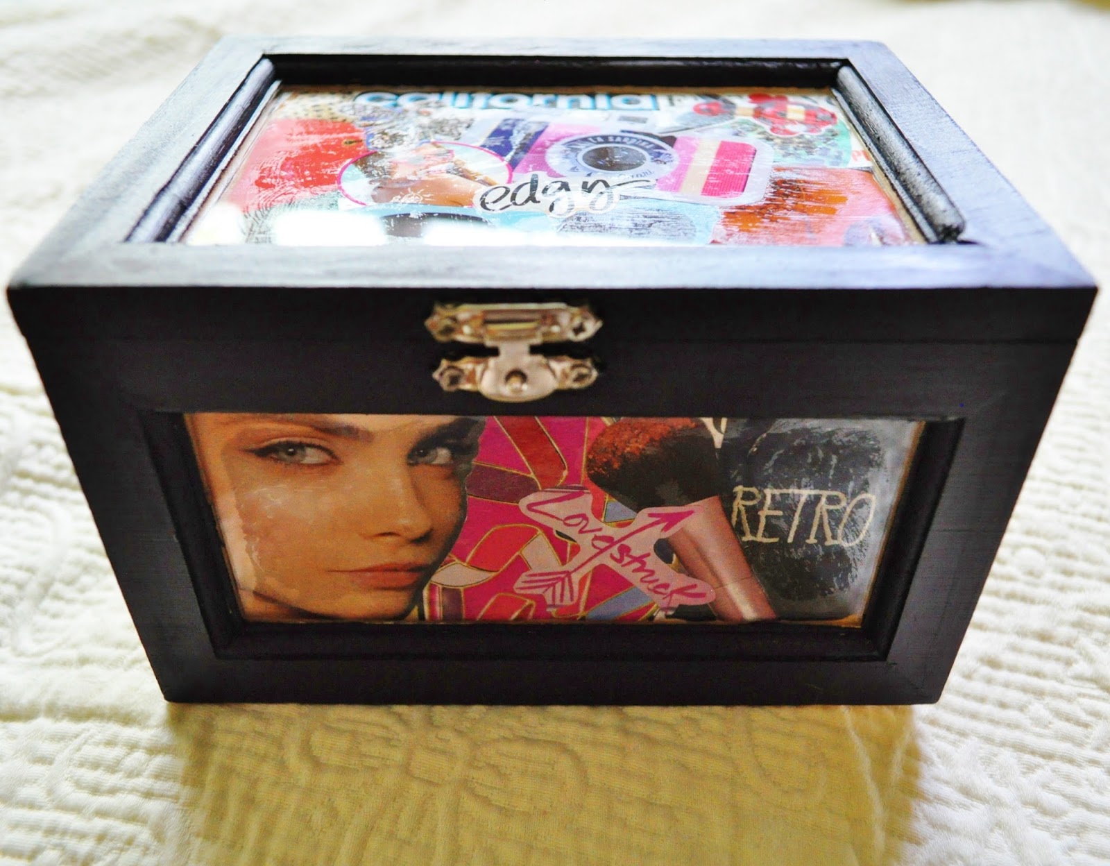
If you want to learn how to make something like THIS lovely thing (I say lovely not because I'm bragging, but because I'm immensely proud of myself, haha) then KEEP READING :)

WHAT YOU'LL NEED:

 1. A wooden box with glass windows (this can be acquired at any craft store, but I went to Michael's)

 2. Mod Podge (for the decoupage part) and a Sponge Brush (I bought 2 brushes - one for decoupaging and one for painting)

3. PAINT for your box.  I bought Martha Stewart Acrylic paint in two colors (because I have two boxes, but I'm only showing one to you all here), "Beetle Black" (High-Gloss), which is what I used for this tutorial,  and "Seaweed" (Satin).  I bought High-Gloss and Satin paints because they would give me the nicest looking surface, with just a bit of luster.

The last thing you'll need are clippings (from magazines, newspapers, a copy of your favorite book, etc.) that you can decoupage your glass windows with.  I grabbed my stack of Seventeen magazines (I've saved them all - I have a few issues from 2008!) and started clipping.  I cut out things that were visually appealing, things I loved (for example, sunglasses and heels), and things that described me - all of these criteria would ensure that this box was MY OWN.  Be warned: this (the clipping and decoupaging) is the most tedious part of this project - it's where the perfectionist in all of us comes out, haha.  Make sure you arrange each window the way YOU want it - after all, this is going to be YOUR box :)

DECOUPAGING YOUR BOX:


HERE'S WHAT I DID TO MAKE DECOUPAGING A LOT EASIER:
I cut out paper rectangles that were the exact size of the glass panels on my box.  I then labeled them (as you can see here, hehe).  I pulled out my magazine clippings and began to arrange them on the pieces of paper.  When I found an arrangement I liked, I would dip my brush into the Mod Podge and paint a VERY light layer over the arrangement, focusing mostly on the edges of each image so that they would lightly stick together.  MAKE SURE you don't put too much, because it might bleed through and end up sticking the panel of clippings to the piece of paper.  A lot of times, all of the overlapping images would go outside of the margin of space I had for my glass window, so I made sure I got all of what I wanted within the white space of the paper.  When the Mod Podge dried (it only takes about 20 seconds), I moved the paper on top of the magazine clippings (instead of under) and held it there.  I took a pair of scissors and cut around the paper so that my clippings (all stuck together lightly from Mod Podge) were the exact rectangular dimensions of my glass window.  I then discarded the white paper, applied a thicker layer of Mod Podge onto the clippings (and a bit on the inside of the glass window) and stuck my images to the INSIDE of the box.

NOTE: For the best results, use Windex or Green Works or any other type of glass cleaner on the panels of your box first - you don't want any unsightly fingerprints or marks stuck in between your images and the glass.  GIRL, THAT WOULD NOT BE CUTE.

PAINTING YOUR BOX:

After the decoupage on the inside has dried, we're going to focus on the OUTSIDE of the box.  Apply painter's tape to each window so that you don't get paint on them.  YOU DON'T WANT TO HURRY UP ON THIS PART - it's important that you're careful and neat so that no paint bleeds through onto the glass and covers the beautiful decoupaging you just worked so hard on!

NOTE: If you don't plan on distressing your box (like I did), it's important that you smooth the wood of your box by SANDING it.  This will allow the paint to take easier to the wood, soften the texture of the raw wood, and overall make it more attractive.  If you plan on distressing your box, however, you don't have to sand it until after your paint is dry - that way you only need to sand it ONCE.

After your box is painted (be careful around the hardware, like the clasp and hinges - if you happen to get paint on them, you can use a damp paper towel to wipe it off, but don't do this until the paint around the hardware is at least semi-dry) and dry, remove the tape from the glass.  If you don't plan on distressing your box or adding any other touches, this is your finishing step!

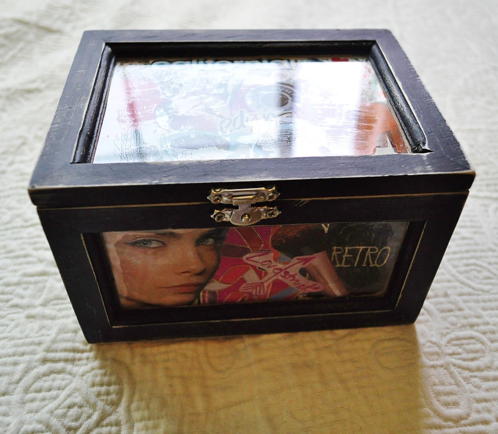
Here's my box WITHOUT the distressing.  The finish looks a little bit rough because it hasn't been sanded.

DISTRESSING YOUR BOX:
(IF YOU WISH TO)

Distressing is simple: take a piece of sandpaper and just begin sanding away over your DRY paint.  Slowly, the paint will begin to rub off, revealing the unfinished look of the wood under.  Distressing also serves as your sanding step, which makes the wood smooth to the touch and more attractive to look at - don't just do this step until you THINK the desired amount of distressing is reached.  Make sure you sand your box so that it's smooth all around.  I even rounded the corners a bit to add to the "antique" vibe.  REMEMBER, your box is going to look amazing either way, so if sanding it properly distresses it more than you originally planned for it to, don't freak out - this effect is always going to look perfect because it doesn't NEED to be perfect.  Neat, huh?

ALRIGHT LOVELIES, THAT'S ALL FOR THIS POST
I know that was a long one, so thanks for bearing with me and reading until the end :)  Let me know in the comments section is you tried this out (post a picture, too! I would love to see your amazing creation :)

Love you all

<3

26 July 2013

The Friday File: Outfit #5

FIVE: "Run Away With Me"

FIVE: "Run Away With Me" by the-saltine-herself

Hello lovelies! So here's another "Friday File" outfit for you - I just made it randomly, so I hope you like it :) Again, the haul that I posted the other day (scroll down a bit if you haven't seen it) is going to be joined shortly by a video twin, which will be on my YouTube channel - make sure you check that out when I post it.  Anyways, that's all for now

Thanks so much for checking out this post :)

Love you all

<3